How to: Harness the Power of the Sun
Bright, punchy, and a little sassy, YELLOW demands attention. While you can find yellow used in so many everyday things — road signs, vehicles, art, or interior design — it pays for designers to know the history of the color, its meanings, and its uses throughout history in the eyes of color experts.
Yellow is one of the oldest colors in history, where people would use turmeric and saffron to form similar pigments for their daily trade. Despite being tied to many different meanings culturally, it most commonly represents sunshine and happiness. Yellow is one of the most vibrant colors in the world and can instantly catch your attention, however it must be used with caution. Yellow hues fatigue your eyes very quickly because they reflect so much light so too much yellow can be bad for your peepers, but just enough can be stimulating and energizing.

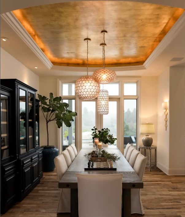
While yellow is one of the oldest colors, it remains a favorite throughout different visual art fields like fashion, art, and interior design. In these creative fields, yellow is considered an uplifting color that evokes warmth and positivity. When looking specifically at interior design, yellow is a great choice in dining areas, kitchens, or bathrooms, especially as an accent.
The key to using the color skillfully is understanding that there must be some restraint. You know what they say: everything in moderation! A little goes a long way and it’s all about how you pair it with blues, grays, pinks or deep green, or how it’s counterbalanced with neutral shades such as black or grey. For example, a great way to add contrast to a yellow accent wall is to add black frame artwork or some greenery. This will tone it down and add some interest.
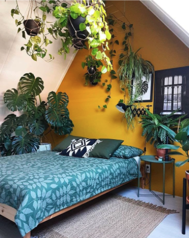
Photo by elledecor.com Photo by Eve Wilson for The Design Files 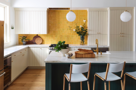
Photo by R. Brad Knipstein for Lynn K. Leonidas 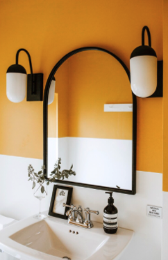
Photo by Rouxby Photography 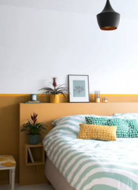
Marij Hessel – My Attic
Although it’s suggested to use this color sparingly, you can also add dimension to a space by layering yellow on yellow. Get creative by integrating a collection of tones, from a soft buttercream to a deep mustard. What’s also important to consider when picking a yellow, is whether it runs more warm or cool. This choice will affect other elements in the room such as furniture and floors. Cooler yellows can be more modern and will work better with silver and grey. Warmer yellows are a great choice when wanting to compliment natural wood floors or enhance gold finishes.
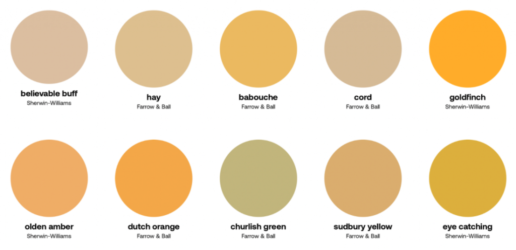
Here are a few of our tried and true hues in this part of the rainbow.
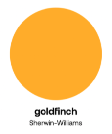
This yellow has a bright, warm, orange undertone that shines really bright. Less is more with this guy.

The secondary tone in this tends to go towards green making it a more true mid century hue for a front door or accent wall. Not always a flattering color, so not for the faint of heart.
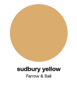
This is more of a historic muted gold that would be a great choice as a background hue for a larger space.
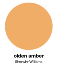
This yellow leans more to the muted orange side, which is the perfect hue to ground a space. This year the earthy tones are becoming popular again, so make room for some ‘olden amber’ as a accent wall in your bedroom.
It can be difficult to find the exact shade and perfect amount of yellow-ness that allows you to reap the benefits of this incredible color and avoid the negative feelings that it can trigger such as anxiety, frustration, and agitation. Because of this, it may be helpful to schedule a virtual consult with a color expert to help you find your favorites for your space.