Understanding Blue: Discover How To Use It For Good
This month we are highlighting the color BLUE! It feels very appropriate for our first color blog of 2024, as paint companies such as Sherwin Williams, Dunn Edwards, and Benjamin Moore have all chosen their color of the year to reflect this hue. Let’s go through it from the beginning to the beyond.

Backdrop
Even though blue is the color of the ocean and sky, its prevalence in nature is actually quite rare. Because of this, blue has a shorter history than others and is the last color to be named in the English language. Blue was first produced by the ancient Egyptians when creating a permanent pigment to use in decorative arts. Blue continued to evolve over the next 6000 years and was commonly used by the world’s most famous artists. And now, by you!
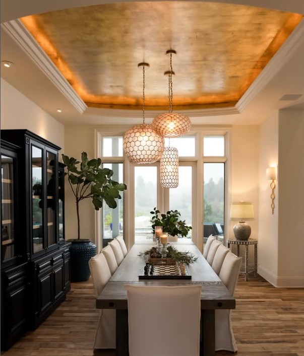
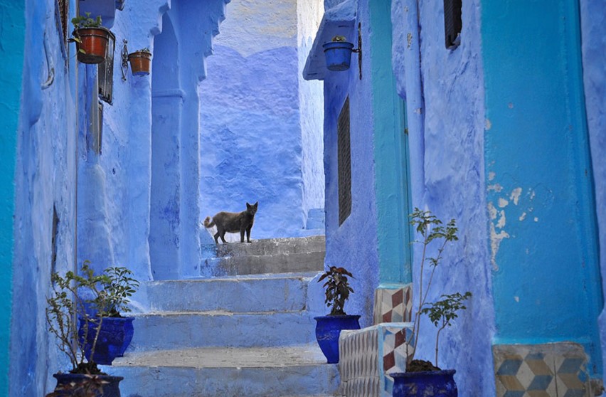
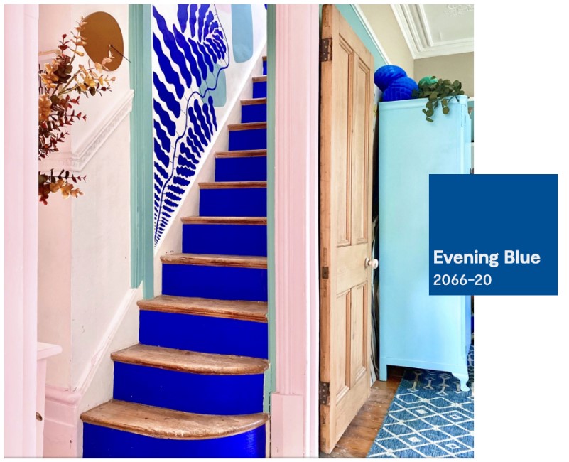
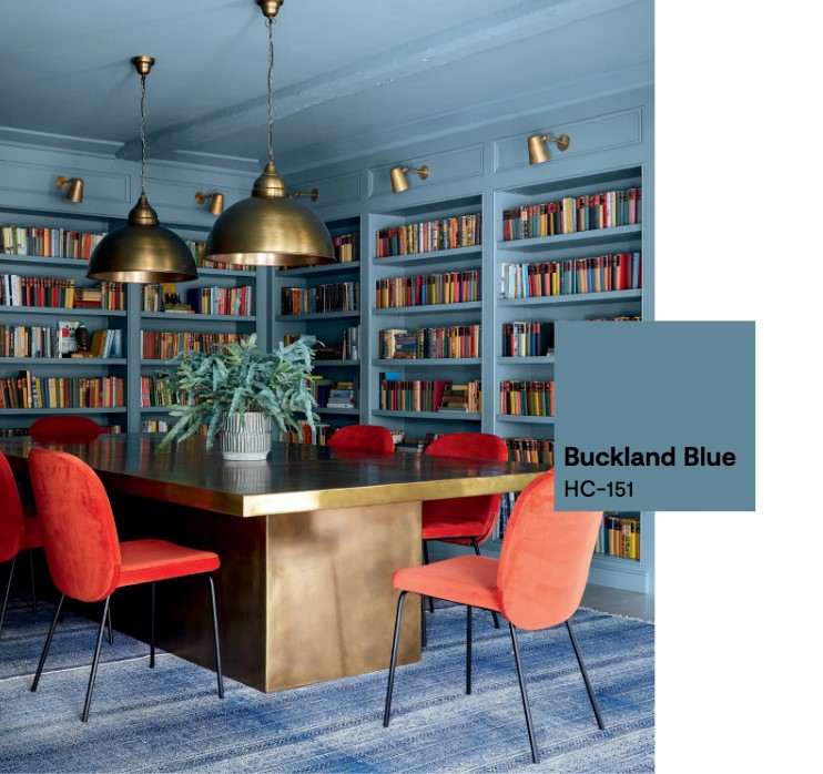
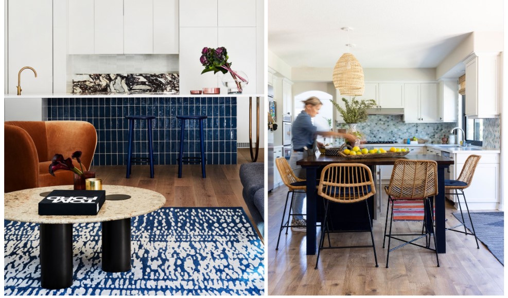
Blue is loved by many as is considered to be the most popular color worldwide! It has very few polarizing traits and represents loyalty, serenity and wisdom. Because it is recognized as a non-controversial choice, many companies choose this color for us all. Blue can be effective when used as both a bold accent color or the primary base for an entire room. Below are two images that reflect both of these design decisions along with paint colors from Benjamin Moore that can help you recreate these looks.
Robin’s Egg Relaxed
Blue can lower your heart rate, blood pressure, and even your body temperature. Therefore we associate it with relaxation. Hence why you may notice that blues/greens are in the design of many beauty spas and yoga studios. Sometimes it just takes a couple blue home décor accents to add a sense of calm to your space. We love this smoky blue vase from Target as an affordable option or this stunning bone inlay tray from Serena & Lily if you’re looking for an investment piece.

Feeling Too Blue
Blue has a down side, even though it is considered to be the most attractive color universally, Too much blue can feel cold and impersonal and may conjure feelings of depression, hence “feeling blue”. It is also known to be the only appetite suppressant in the color spectrum, which is why many restaurants may steer clear of this color in their design. Food for thought when you’re deciding on whether you want those baby blue tiles for your kitchen backsplash! Maybe give it a try if you’re always on a weight-loss journey.
Make it Rain!
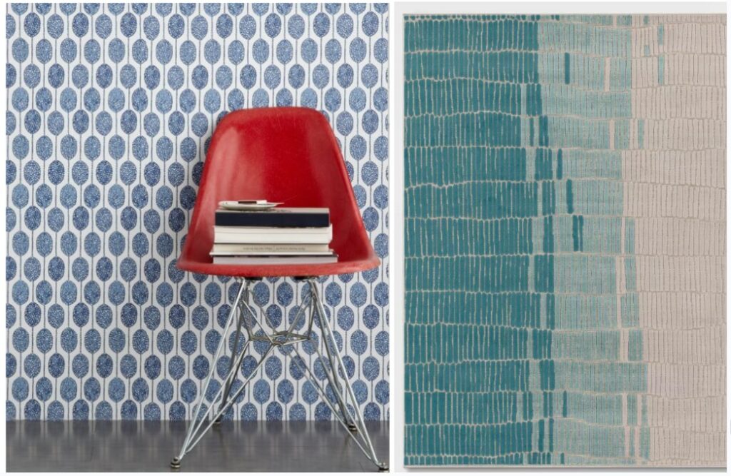
Like any color application, the goal for us as designers, is to use it intentionally. Blue can be effective when used in full force! Sometimes, less is more, and loud statements are made when used in small pops. Paint, wallpaper, tile, furniture, rugs, curtains – there are so many ways we can layer multiple shades of blue or bring a fun pattern to our home. We bet that this wallpaper from West Elm would be a beautiful accent to a kids room and this rug from Target would add just the right amount of fun to an outdoor patio. When it comes to blue, the sky’s the limit!
*Designer Tip: Even though blue is a very versatile color, consider contrasting it with some warmer colors to avoid any overwhelming or depressive vibes. If you feel stuck during your design process consider scheduling a virtual consult with a color expert.
Until next time!
-JG