White Walls: A Guide to the most important neutral
White embodies pureness, innocence, wholeness, and completion. It’s the perfect hue or (lack of) pigment, and the ideal partner & compliment to the shades on your walls that will bring balance to your space, yet allow everything else to stand on its own. Whites are best known for their traditional roles as ceiling, trim, and stark gallery walls that allow art pieces to shine, but in the past few years a new version is slowly making its way back to center stage throughout entire homes. White is the vanilla ice cream of colors, so you can rest assured that all your favorite toppings are going to be hella good on that sundae.
Ahhh…it sounds so wonderfully simple. BUT – there’s always a but- white is also the most excruciatingly elusive hue and the hardest to pin down for a wall color since there are literally thousands to choose from. Literally. Thousands. There are entire fan decks dedicated solely to shades of white and off-white.
That is overwhelming.
It’s all about the undertones, baby- those secondary colors that make shades of white look yellow or red or blue or gray and can very quickly lead to confusion and anger and painting the living room for the THIRD time, dangit. Recognizing those undertones before a color even goes on the walls can be a lifesaver, but it’s okay if you can’t. You can always enlist the help of a color consultant who can walk you through what whites will and won’t work in your space.
Totally off-topic, have you guys seen that our Virtual Services are up and running? Pop on over there to grab a one-hour design consult or, I don’t know, a remote color consultation. Crazy.
Okay, to stave off your panic and sense of impending doom over choosing what was SUPPOSED to be a simple wall color, here are some go-to’s to give you confidence at the paint counter:
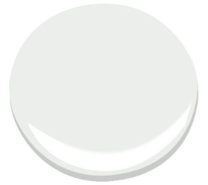
COOL WHITES
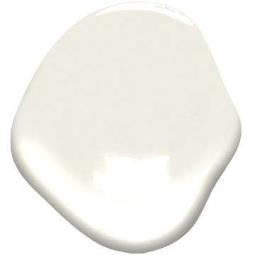
Paper White OC-55 by Ben Moore
Off white with a tiny tint of gray that allows all that white porcelain to glow in a bathroom, and keeps a space light and bright without being blinding.
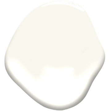
Chantilly Lace OC-65 by Ben Moore
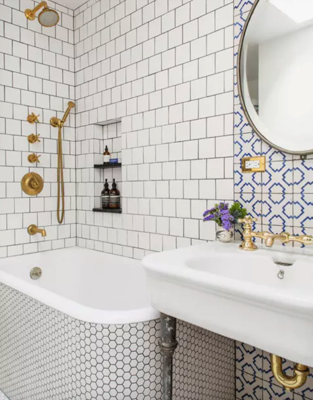
A subtle and new tint to the Ben Moore collection, it’s not grey forward but slightly crisp and bright. Looks great with Carrara Marble in your kitchen or bath.
Decorator’s White CC-20 by Ben Moore
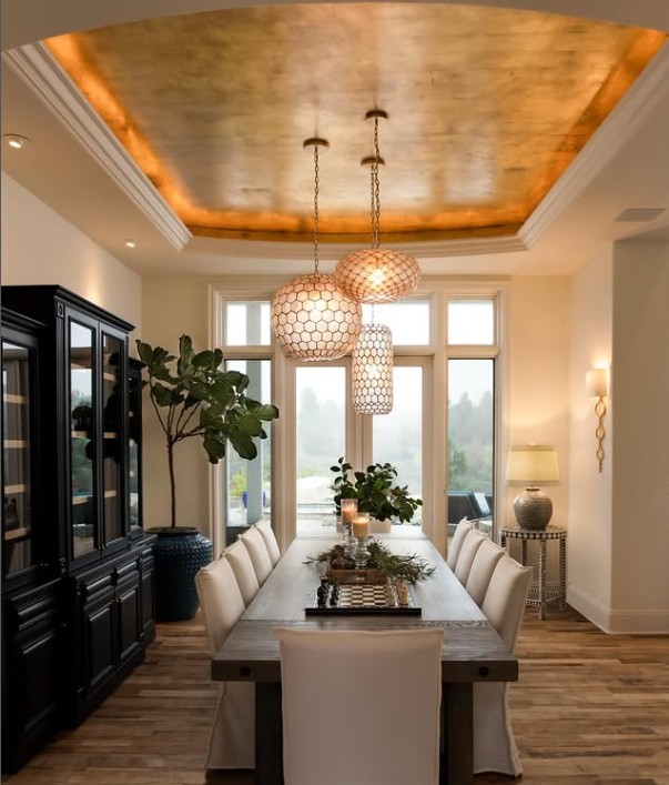
Tinged with blue undertones, this is a truly cool tone that compliments and brings balance to any predominately warm color palette. Our favorite way to use this hue – utilize it to bring height to your existing ceilings.
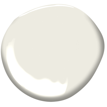
WARM WHITES
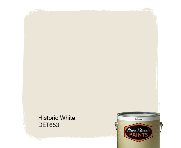
Historic White DET-653 by Dunn Edwards
Classic warm white without any peach or pink hues that keeps a timeless look on walls or for small spaces.
Dune White 968 BM by Ben Moore
Dune white (also known as Glacier white AC-40) is a warm white without the yellow undertones that most off-whites tend to have.
Atrium White OC- 145 BM by Ben Moore
A tiny little warmth can go a little way and the small doses of sunshine emitting from Atrium can brighten up cabinets, trim or even an entire home.
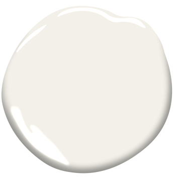
NEUTRAL WHITES
Swiss Coffee OC-45 by Ben Moore
Just like the country from which its name is derived, Swiss Coffee has a balance that doesn’t allow it to sway too cold or warm. Brighter in luminosity than other shades, it always looks clean & will never go out of style.
Simply White OC-167 by Ben Moore
Once deemed the color of the year for Ben Moore paints, this clean classic can look modern or traditional. It brightens up any space without looking cool or warm. One of our personal favorites. Perfect for trim!
Balboa Mist OC-27 by Ben Moore
Great for an entire room or rooms this hue serves as the perfect background for the more modern room (think RH or Pottery Barn).

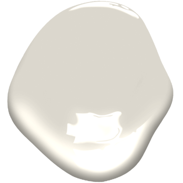
White Sand BM OC-10 by Ben Moore
For the traditionalist, this feels more like a greige with a balance of cool & warm to set the stage for any design style.
TIPS AND TRICKS
Choose your ceiling/trim color last! That way you can see the secondary tones in your whites. It makes the process go twice as fast when you can place it next to your other hues to see how it compliments them, and you can make sure everything coordinates exactly how you imagined.
Anti-white? Maybe you rent and the stark white apartment is driving you B-A-N-A-N-A-S? Snag yourself some peel-and-stick wallpaper to liven up an accent wall with a bold color or geometric pattern. Keep yourself and your landlady happy. Check out this minimalist wallpaper from artlinkwallpaper available on Etsy!
White linens are beautiful and airy, and collectively remind us of warm summer days spent in the back yard with the sun shining and laundry drying on the clothesline. Unfortunately, whites are difficult to keep white. I just bought new white towels and put them next to my older white towels and…woof. Check out this bleach alternative from The Laundress to keep your whites bright and shiny without the bleachy chemical ickiness.
MAGIC ERASER = SQUEAKY CLEAN
Use a Magic Eraser to get the handprints off of doors, light switches, tile, countertops, laptops and heavily used areas (anyone else have a dog that loves to run their ENTIRE BODY along the side of the hallway wall?). If you want to make your own use this:
- 1 tsp baking soda
- 1/2 tsp of Borax
- 1/2 cup hot water
This makes just about enough to clean a small room, so adjust accordingly!
Photo cred to ispydiy.com
Still not sure that you’re comfortable with choosing a white for your space on your own? Schedule a virtual color consultation or one-hour ask anything session over at our Virtual Services page.
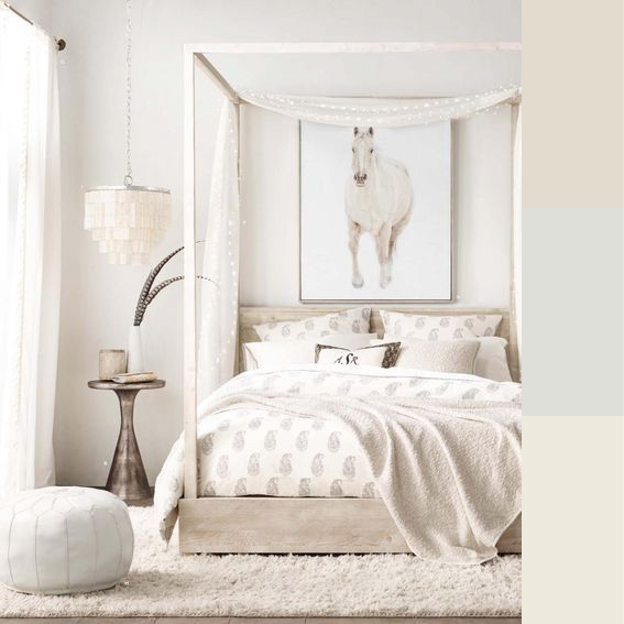
Cover Photo credit to RH Teens at www.rhteen.com/rooms/